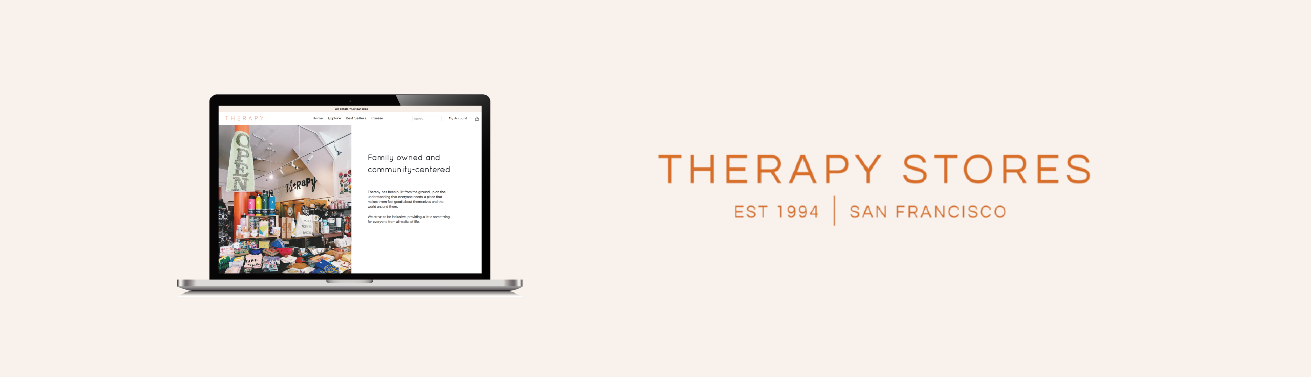
Therapy Stores
Therapy is a family-owned business in the Bay Area
Project Overview
For this project, we were asked to work with a local business and design, build a website for them using HTML, CSS.
Role:
Web Designer, UI Designer, Researcher
Tools:
Github, Sublime Text, Figma
Timeline:
A month
Who am I designing for?

Image from Therapy Stores website
Therapy Stores that sell apparel items, furniture, accessories, and gifts in the Bay Area and Portland.
01
Research
Research
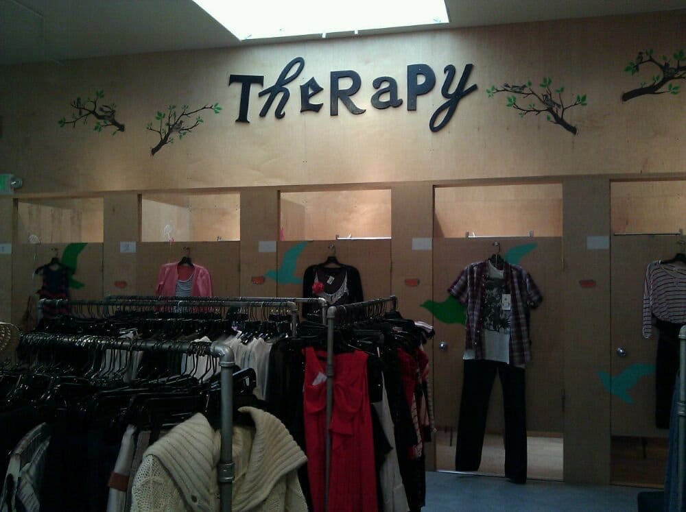
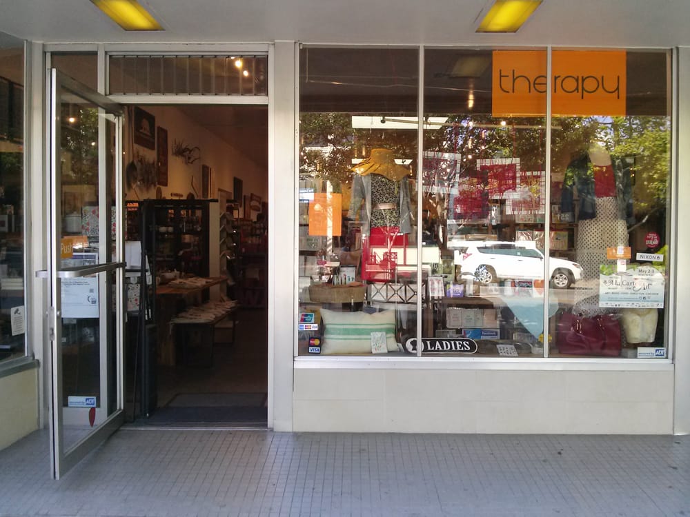
images from Yelp.
1.1 Questions for the store
Q: What information or function would you like to add on the website?
A: We would like to add a map of the vendors from the USA on our website to show the customer where we get our products from. we are also thinking about adding an online shopping section for our website, mostly just for the jewelry we sell. And we would also want to make our career page more visible. We want to highlight the fact that we donate 1% of our total store sale to our customers.
Q: What kind of color tone would you like for the website?
A: We have always been using orange for our store for some reason, so I think we would like to keep using that color. But we actually want to make the website a bit more colorful.
Q: what do you think about the warm tone colors?
A: oh, I think that is a great idea. We would love to see how that comes out
Q: What message are you trying to convey with the store’s brand?
A: well we mostly just want the customer to know that this is a family own business and we care about our community a lot, we contribute to charities such as Planned Parenthood, AIDS Walk, The Legislative Drafting Institute for Child Protection, the American Foundation for Suicide Prevention, the St. Johns Food Share, Alameda and Santa Clara food banks, and a variety of local schools through Adopt-A-Classroom.
02
Define
After the interview, I gained a lot of insight into what the client cares about and what I can include in the website layout and design...
2.1 What am I trying to provide with this website?
The website will provide information about the jewelry products and an explore page of the vendors the store works with; this includes a map that highlights the state that the vendors are from. When you click on the highlighted state it will have a picture of the jewelry from the vendor that is from NYC. The client also wanted to let the customer know they donate 1% of all the sales.
2.2 Design Goals
- Maps of vendors
- Family owned business
- Jewelry shopping section
- Orange and warm color tones
- Highlight the donation info and career page
03
Design Process
3.1 Sketch
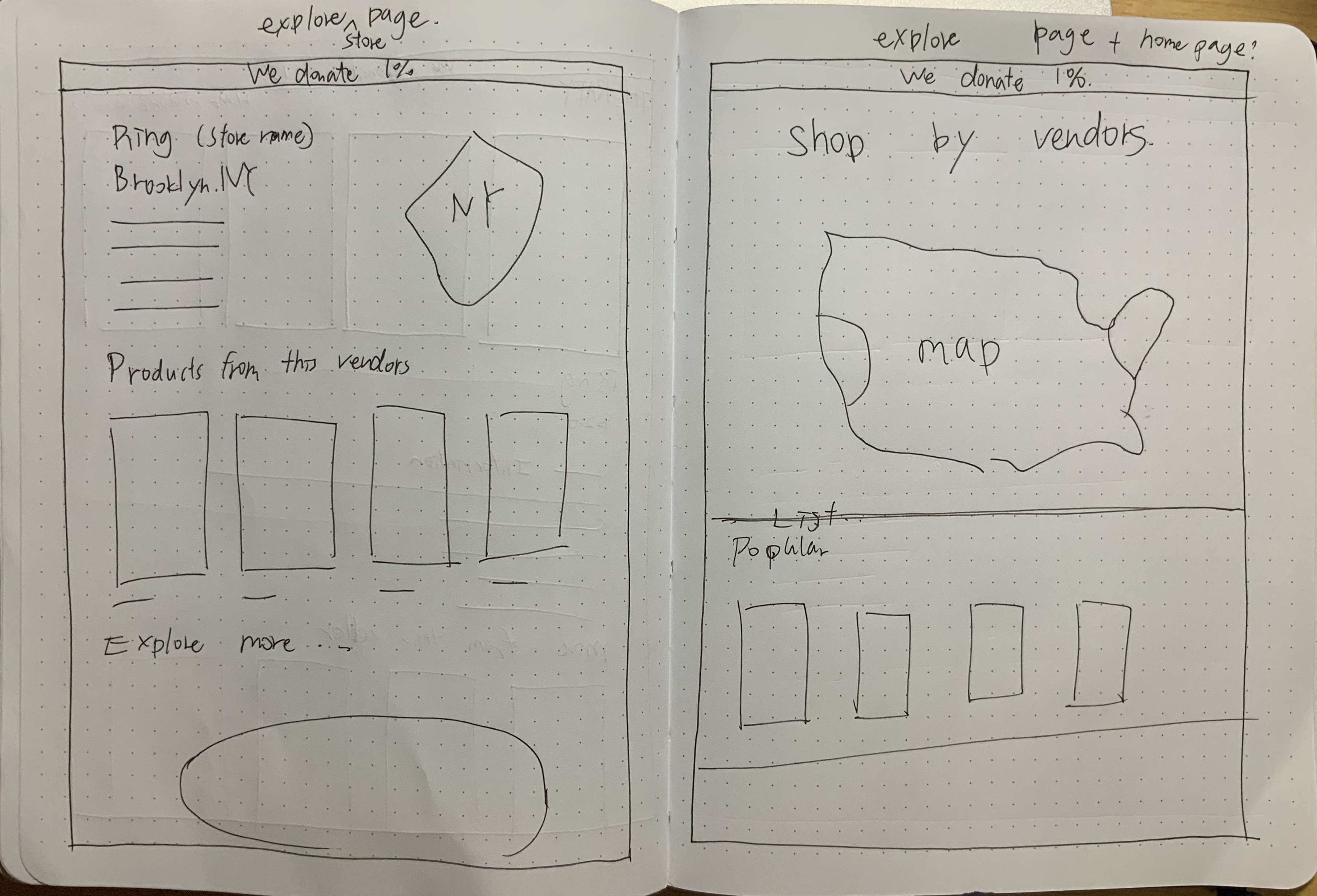
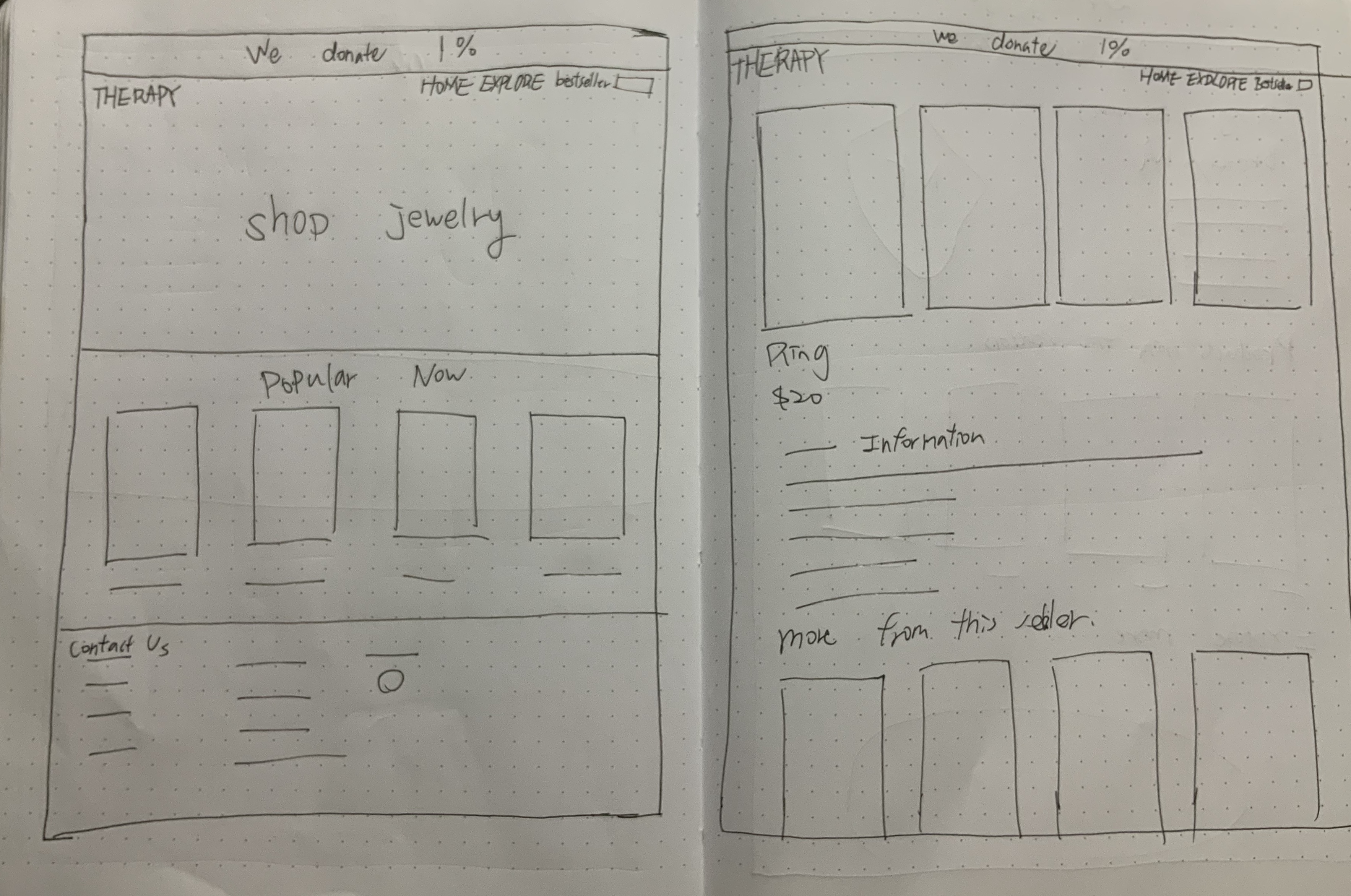
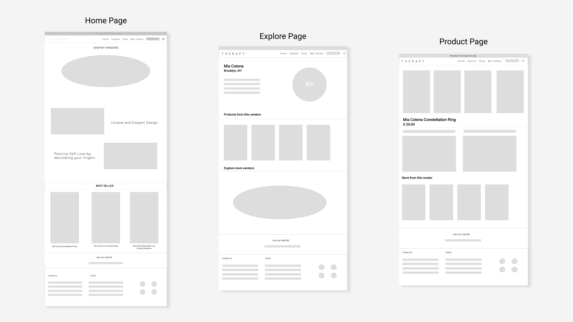
3.2 Wireframes
04
Design Iterations
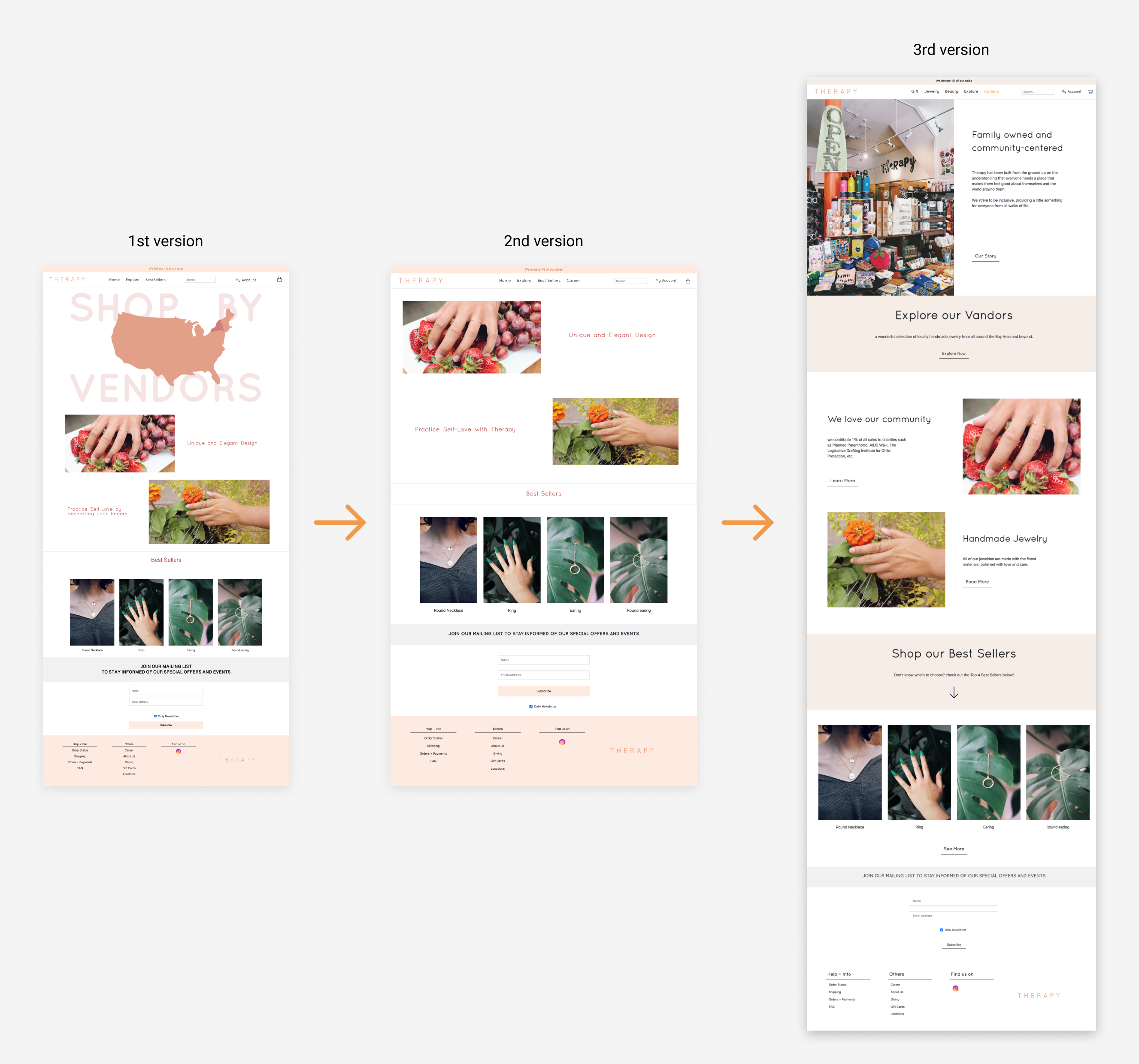
4.1 Homepage
Second version-
I removed the map on the 1st version homepage because it confused users when they first enter the store website and some small layout arrangements.
Third version -
I changed the orange color to a darker and faded tone because the brighter orange takes away too much attention and makes it hard to focus on the rest of the info. I also added a page about the store background on the top because I wanted the user to learn about the store first. I rearranged the layout for the product shots so it would be easier for the user to view.
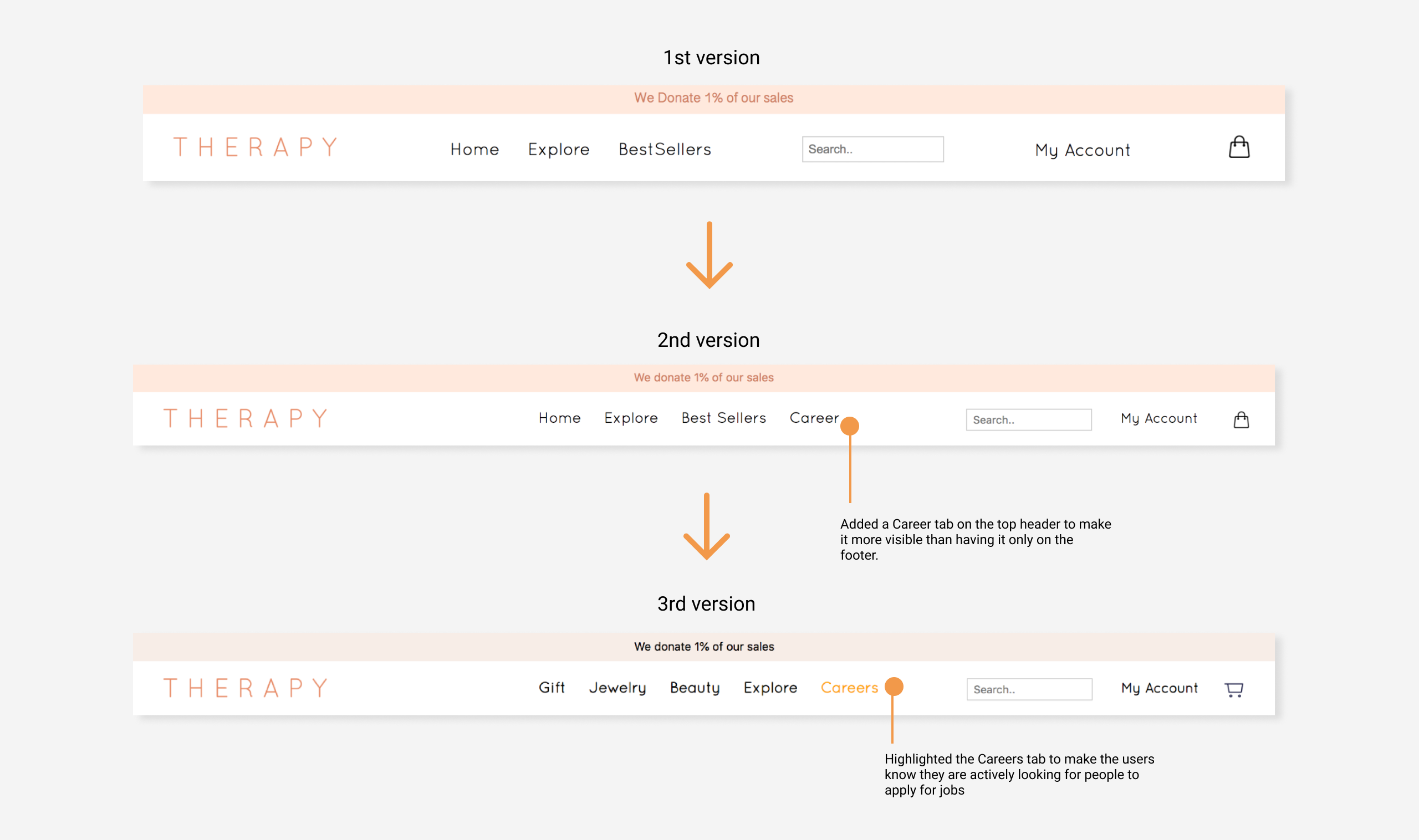
4.2 Header
4.3 Explore Page


Yung Chuan Su 2024