Coachella rebranding
New branding for Coachella Music Festival
Project Overview
Designing the logo and the overall look and feel and applying this to multiple pieces of marketing
Role:
Visual Designer
Designing the logo and the overall look and feel and applying this to multiple pieces of marketing
Role:
Visual Designer
Tools:
Illustrator, Procreate
Timeline:
A month
Illustrator, Procreate
Timeline:
A month
01
Define
1.1 Questions
to start
- What has Coachella done in the past?
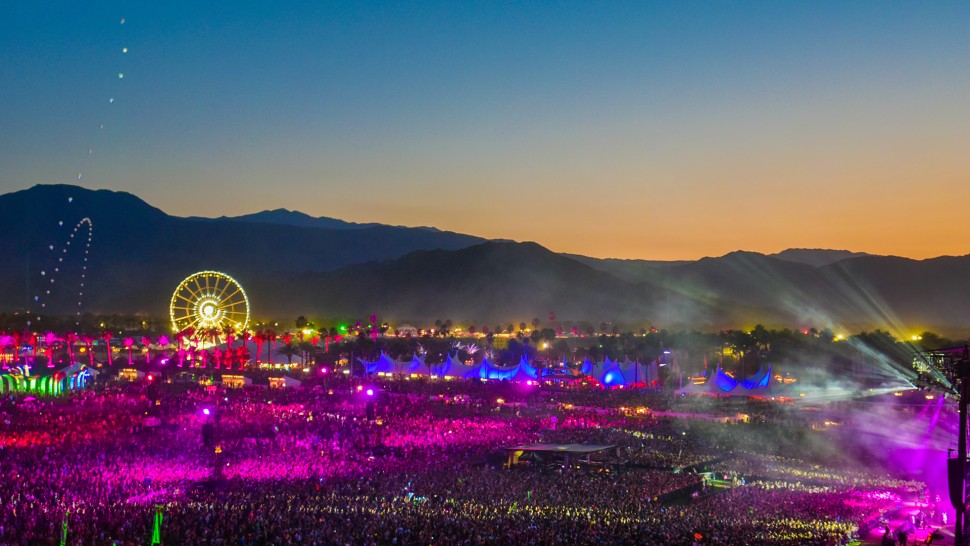
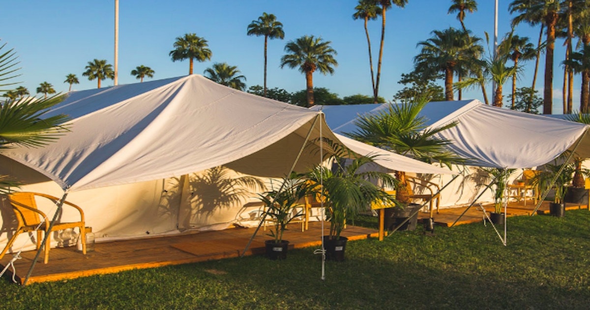
They have used mostly sky colors and palm trees as the theme for their branding.
- How was it used across multiple communication/marketing materials?
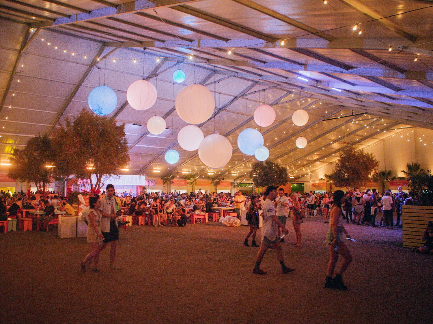
It was used among all of their social media platforms, and they look the same every year.
- What is the mood/tone/voice? What message is it communicating?
Who is it communicating to?
The mood/tone/voice is very natural, warm, and direct. I believe the message it is communicating is that people can experience the real California, its beautiful nature, and music altogether at once.
1.2 A little bit of research
- Who are the competitors?
1. Austin city limit festival
2. Outside land
3. Lollapalooza
- How they are reaching their audience?
They are all using social media platforms such as Facebook, Instagram, Twitter etc to promo their events.
02
Research
2.1 Competitors
All the other three competitors have more different elements such as illustrations, shapes and it gives a strong funky and exciting vibe.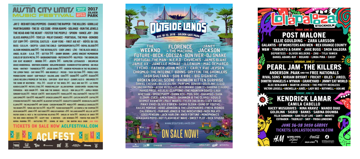
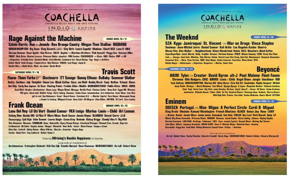
2.2 Coachella
posters
Coachella posters haveno visual elements to combine all of the texts together. It is more like a picture in the back with blocks of text in the front.
2.3 Tones for new branding
Bright
Funky
Exciting
03
Design Process
Design Process
3.1 Inspirations
![]()
![]()
![]()
3.2 Logo Explorations
I think the original logo is Coachella’s key identity.
The simplicity is the best thing about the logo, it is easier to understand and very memorable.
I wanted to keep it the way it already looks like and just to change it slightly.
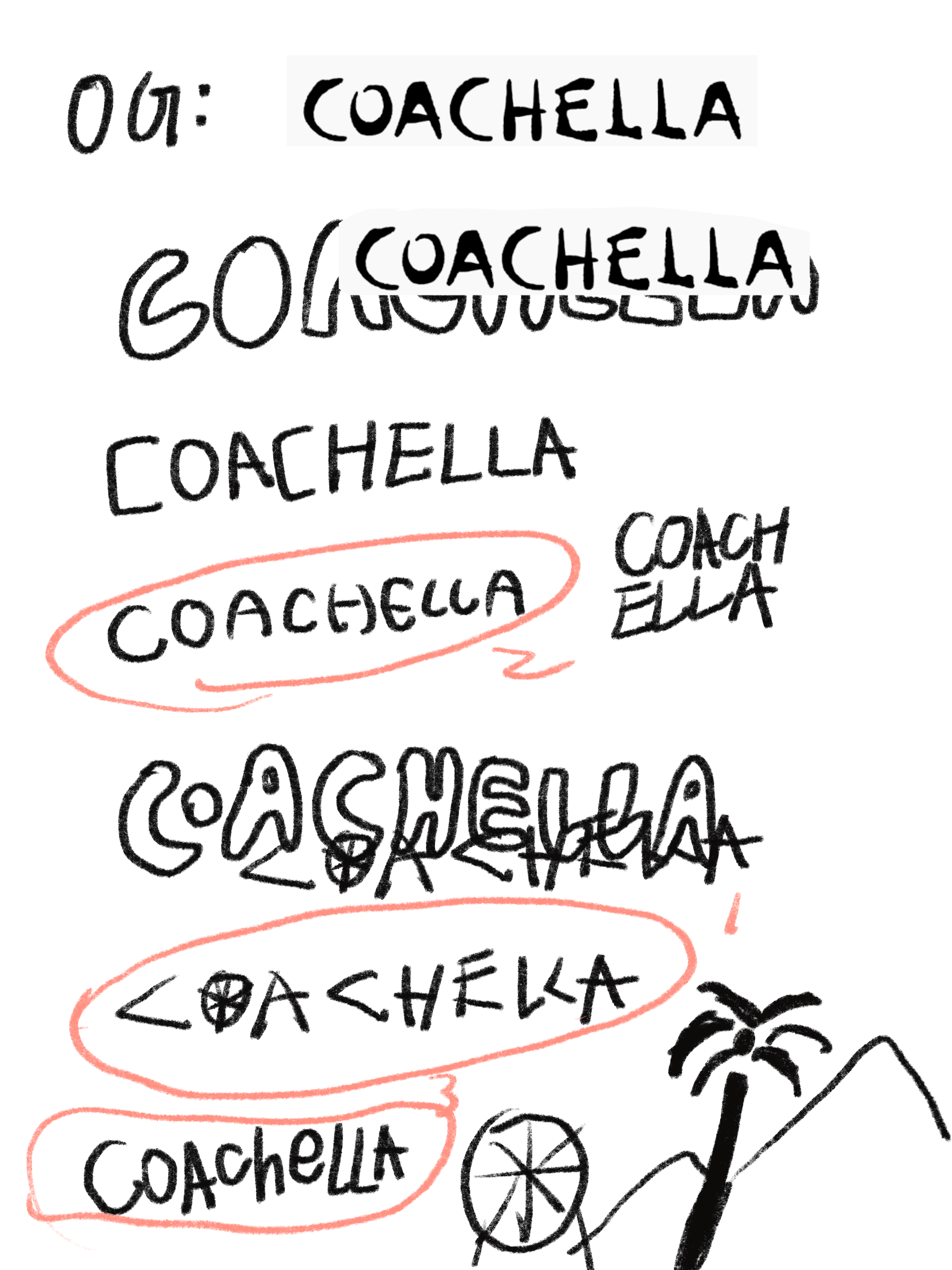
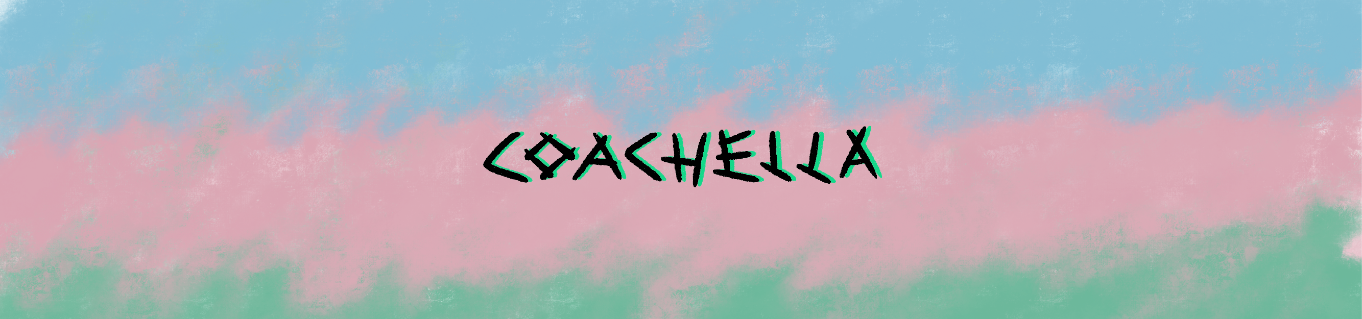
3.3 Final Logo
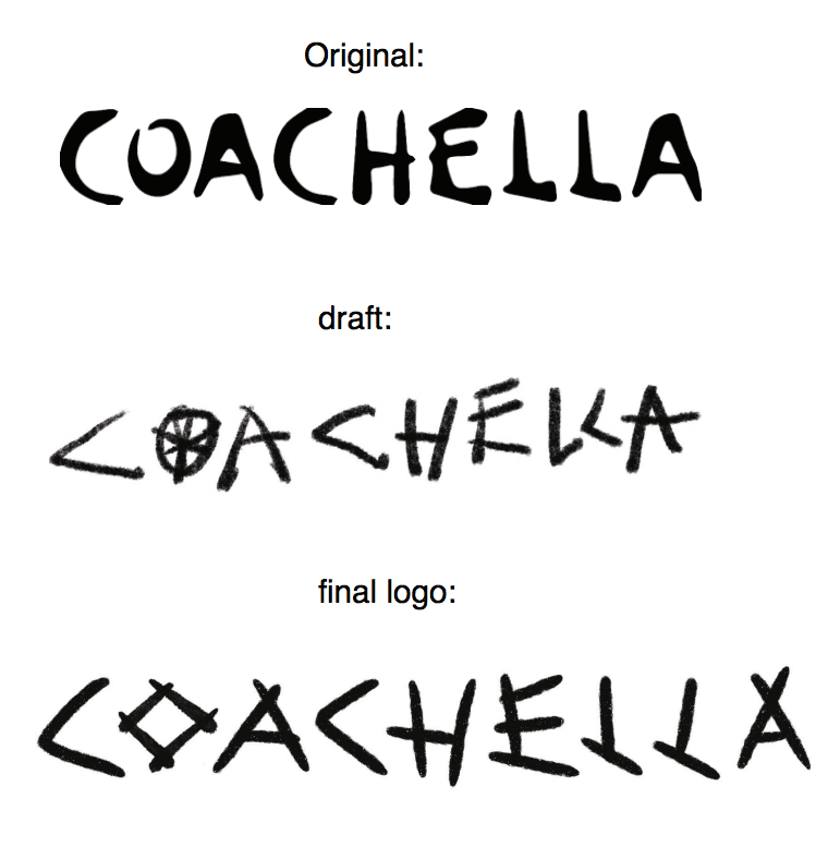
I made the font stick-like because when I think of Coachella, I think of bonfire, camping tent, palm trees.
They all have sticks elements in them.
Therefore, I made them rougher and stick-like. The original one is more curvy and bubbly
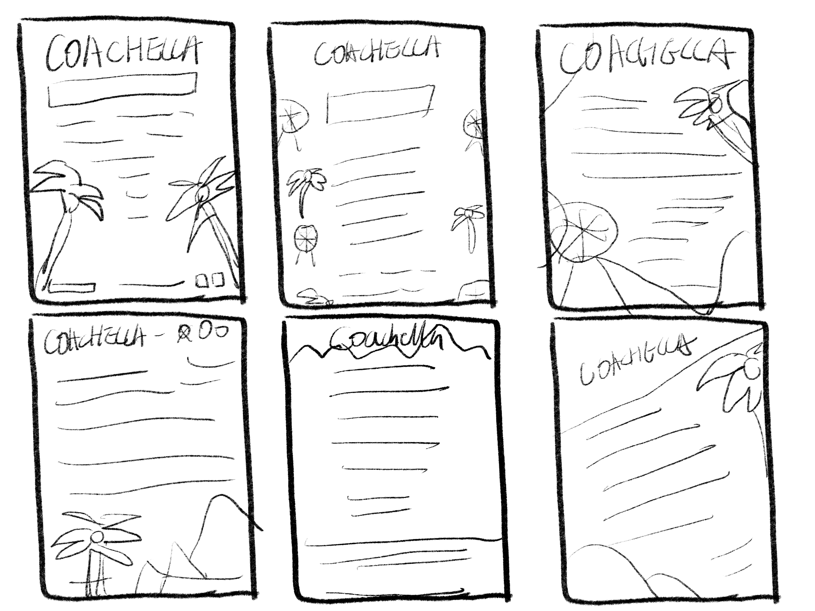
3.4 Sketches
I started with some simple layout sketches for the posters.
04
Design Iterations
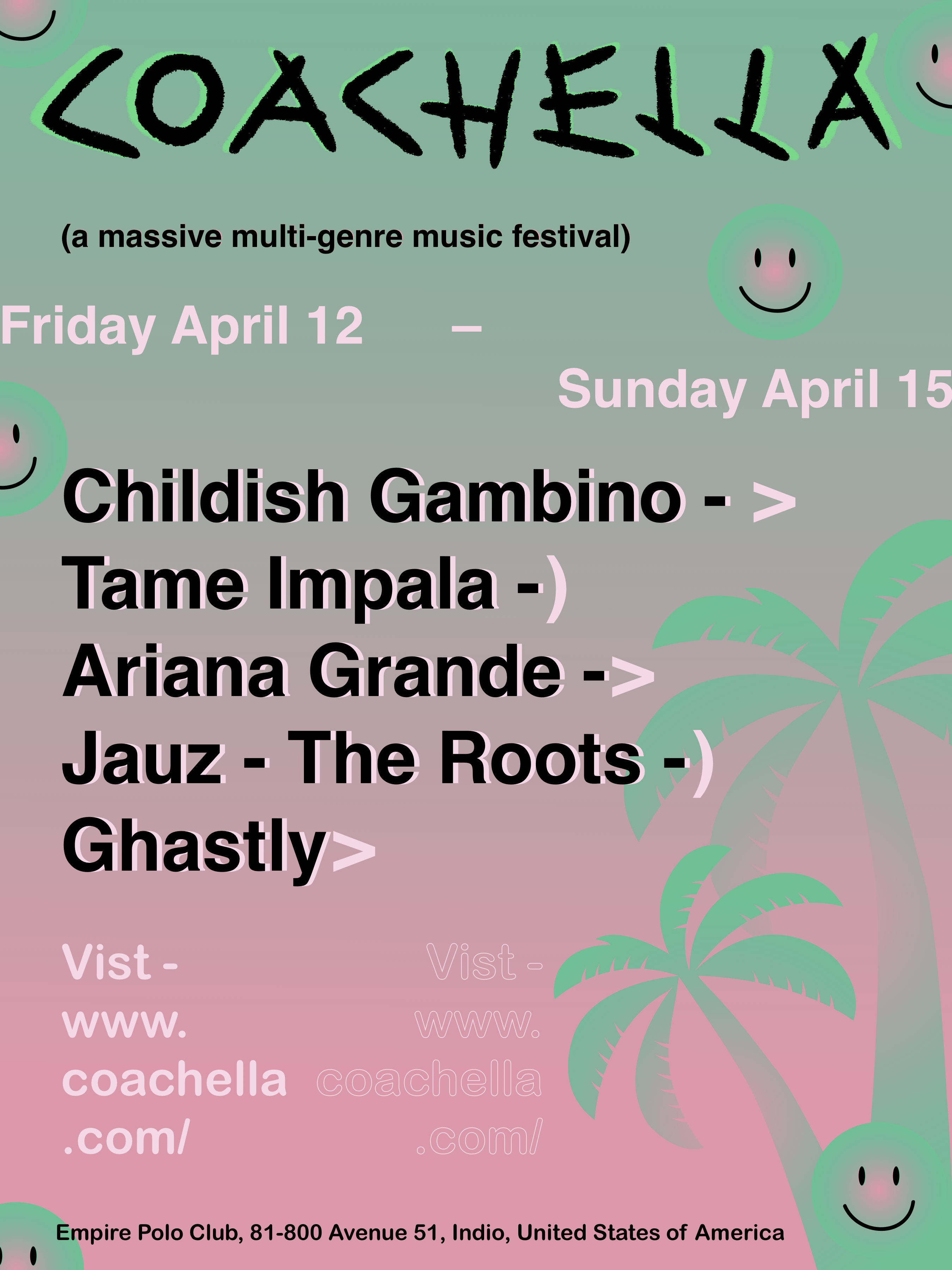
4.1 1st version
Colors: I chose those colors because that is mainly used in their art installations in the festival and the colors also give out the funky, fun, psychedelic vibe which is what Coachella is like.
Smiley face: I included the smiley face because it was actually used before in one of their past art installations and it is also a symbol of fun psychedelic times.
Palm trees: I also added the palm trees since there are so many in Indio. People like the idea that it is tropical and hot.
4.2 More Iterations
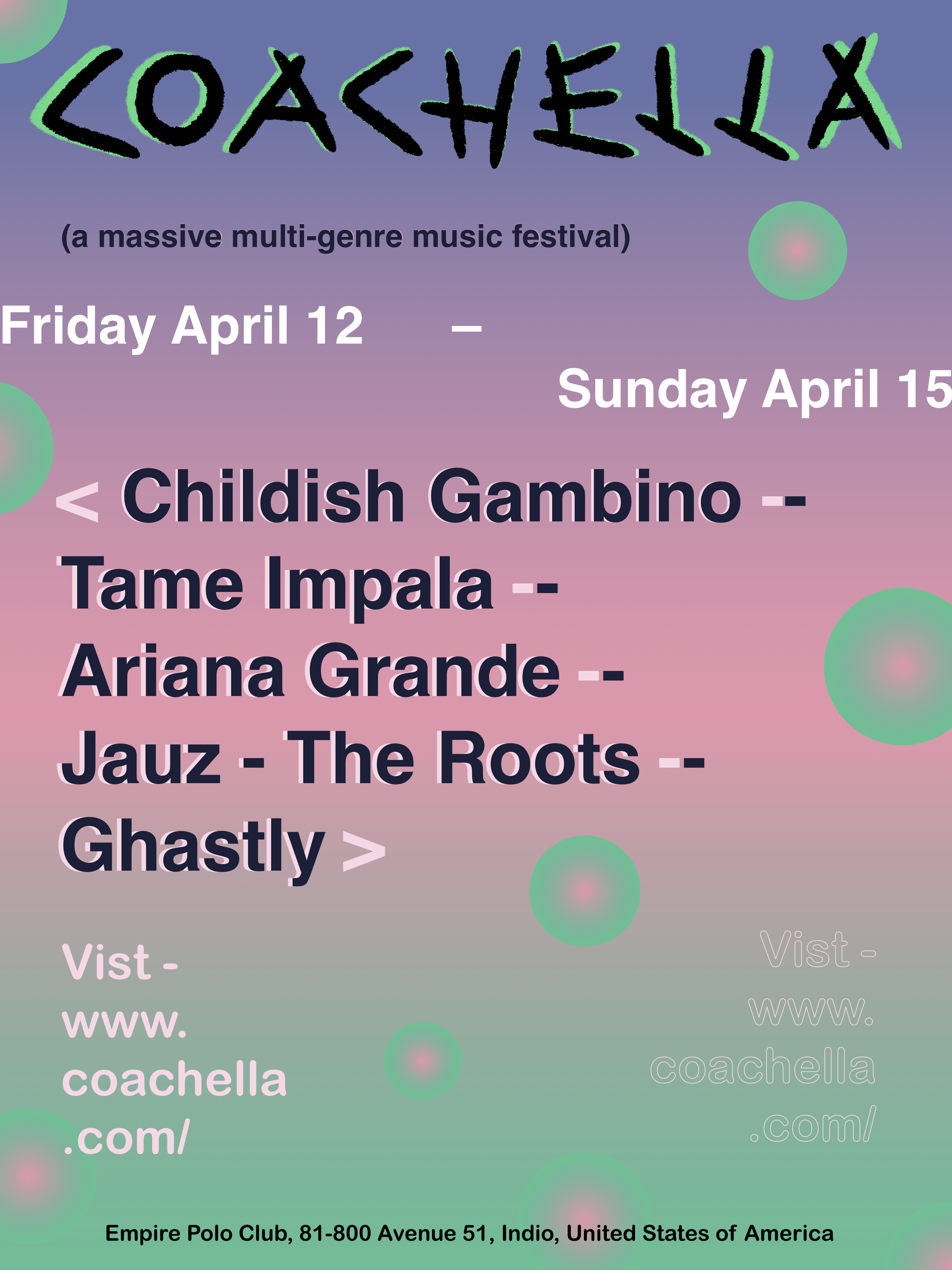
I made the chang based on the feedback from my peers and professor. I removed the palm trees and smiley faces because I wanted to challenge myself to use something else to represent what it already is. I changed the background colors. Blue represents the sky, pink is the sunset, green is the palm trees. I kept the circles because it creates a glowing effect like the lights seen in concert, they also bring some dimension to the poster.
05
Final Outcome
05
Final Outcome
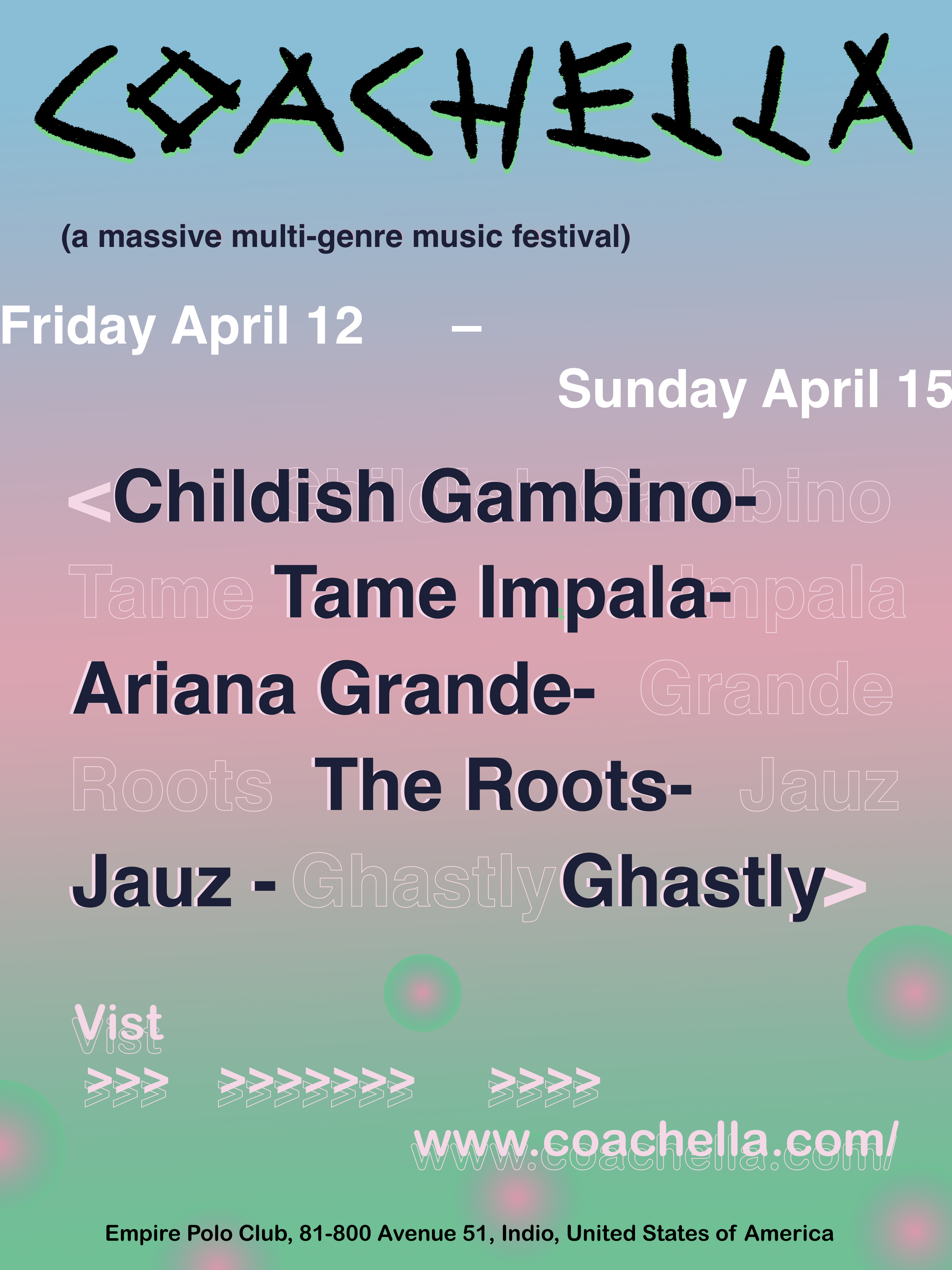
I made the background and other elements like the dash and arrows a little bit more organic and rough to match with the logo. It makes all the elements in the poster more cohesive.
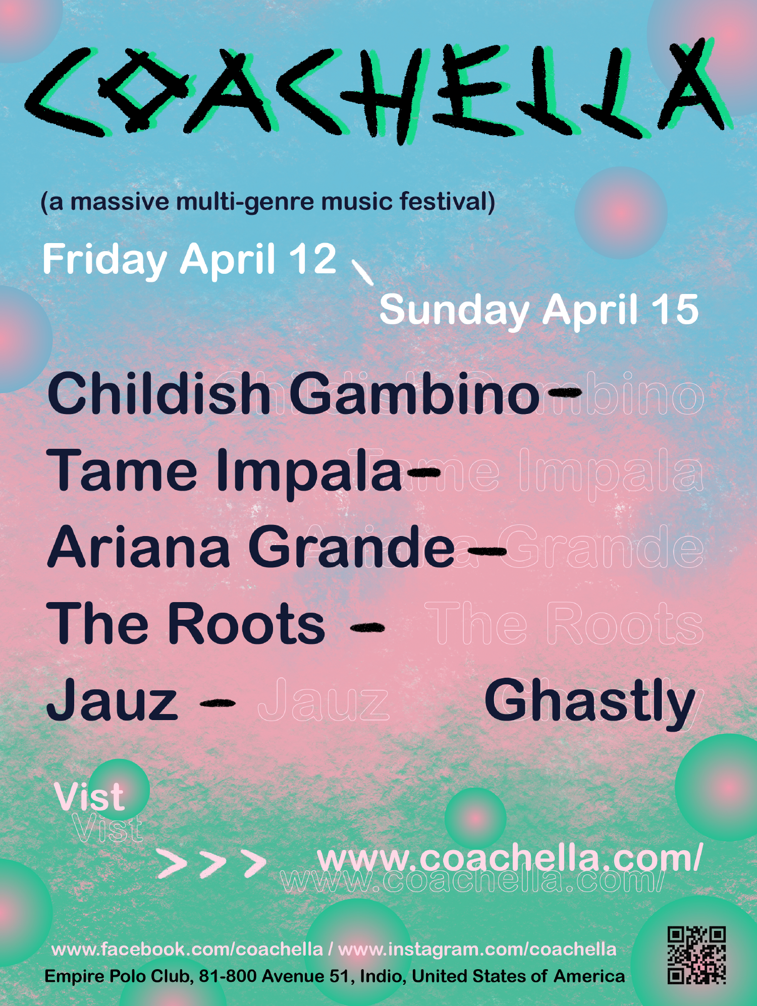 Poster
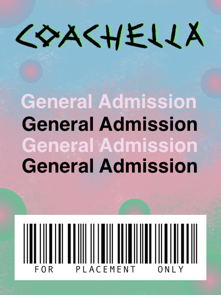
GA Pass
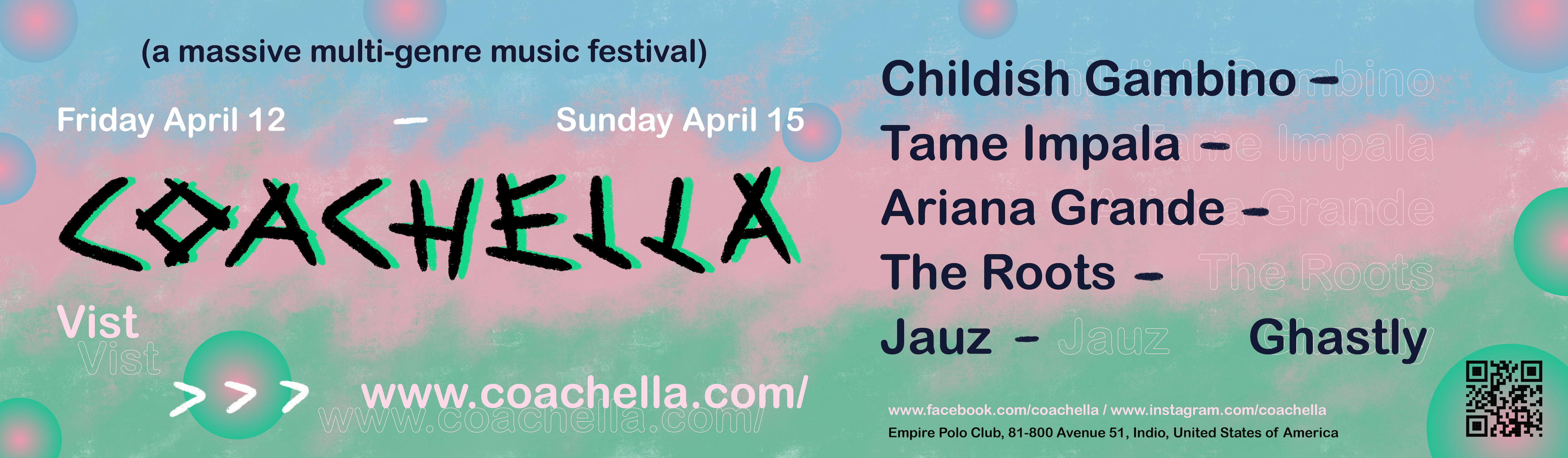
Billboard
Yung Chuan Su 2024