Boba
A mobile app that helps people to find the best boba store nearby.
Project Overview
Mobile app project for the Interactive Design I course
Role:
UX/ UI Designer, Illustrator
Mobile app project for the Interactive Design I course
Role:
UX/ UI Designer, Illustrator
Tools:
Adobe XD, Figma, Illustrator
Timeline:
Original Design - 3 weeks
Redesign- 1 month
Adobe XD, Figma, Illustrator
Timeline:
Original Design - 3 weeks
Redesign- 1 month
Quick Links
Why Do I want to design Boba?
Why Do I want to design Boba?
As a proud Taiwanese and boba lover, I have a high standard when it comes to milk tea and pearls. I struggled to find the best boba shop when I first moved to the US and so did my other friends that like boba. So I thought to myself... why don’t I design a better review app and just for boba? 😍️
01
Define
Define
1.1 Problem
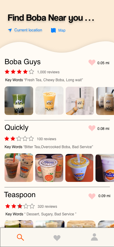
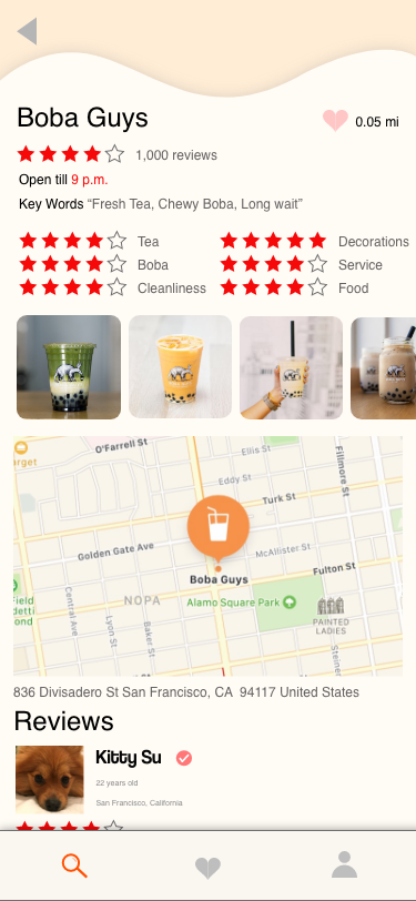
The review apps I have tried in the past don’t have enough information for me to find the boba store that fits my taste. I often lose my punched cards for the boba stores because they are so tiny and thin. The other thing is that I always ended up running late because of the long line in the boba store which is frustrating. I wish I had known about the line before I went.
1.2 Solution
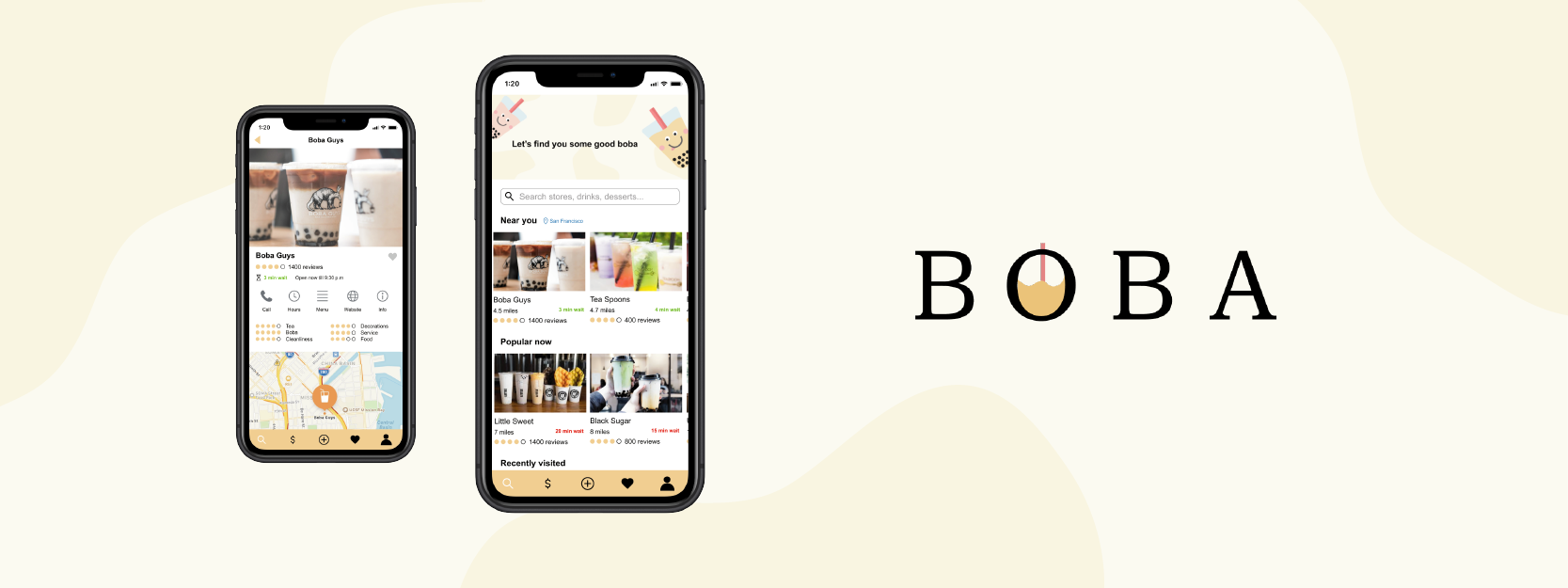
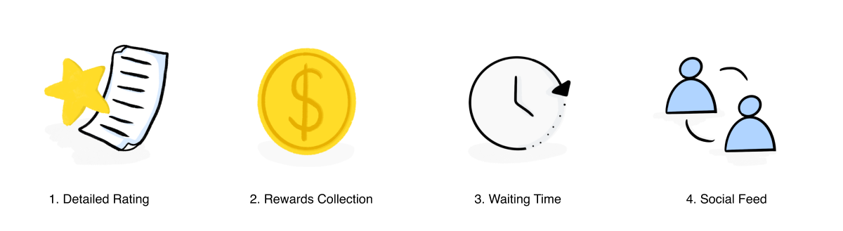
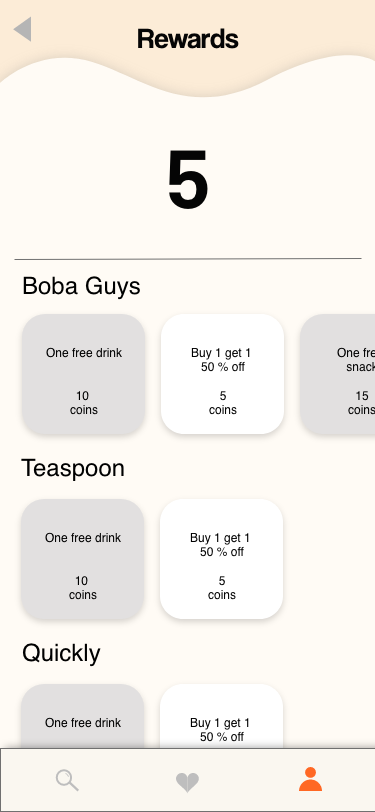
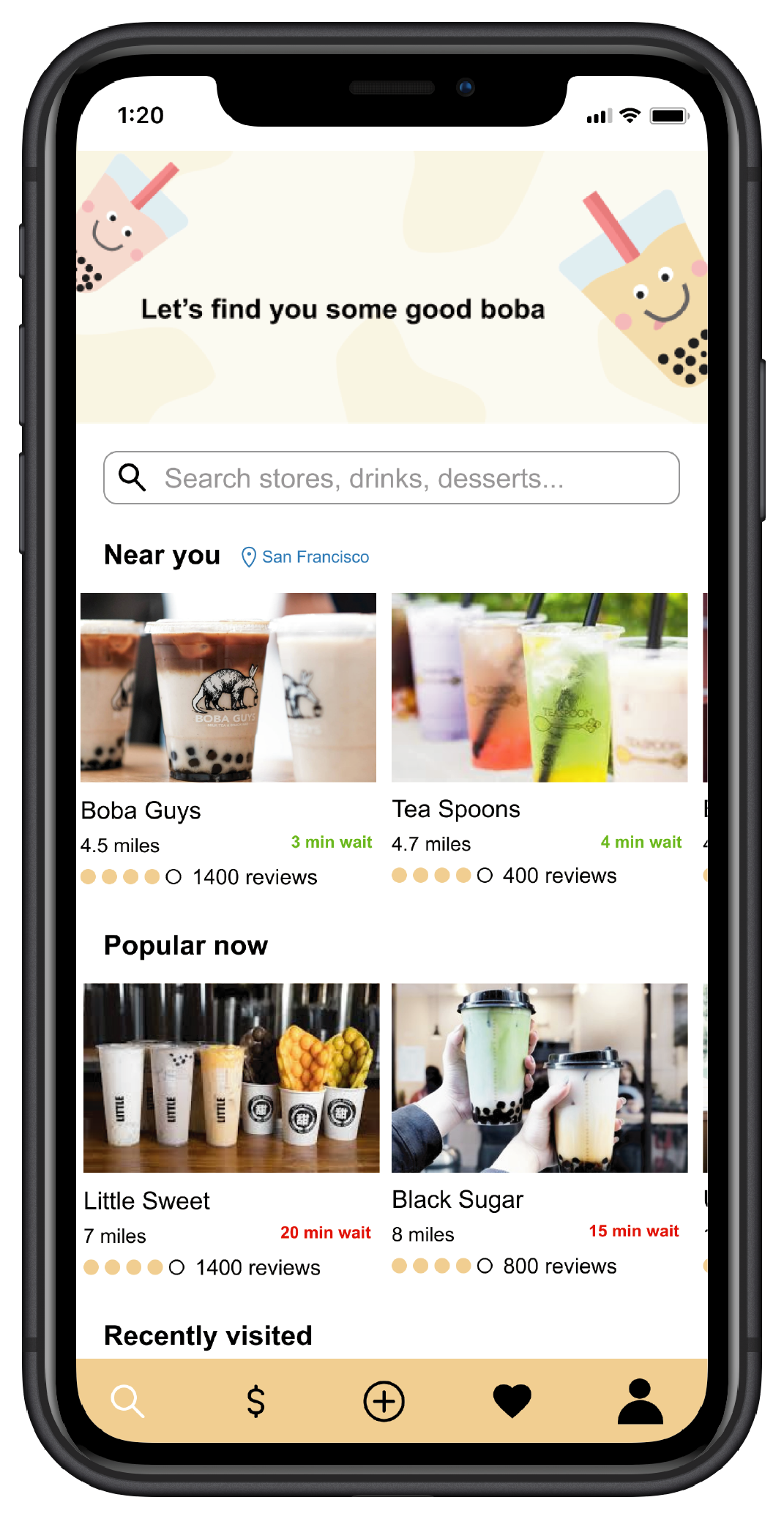
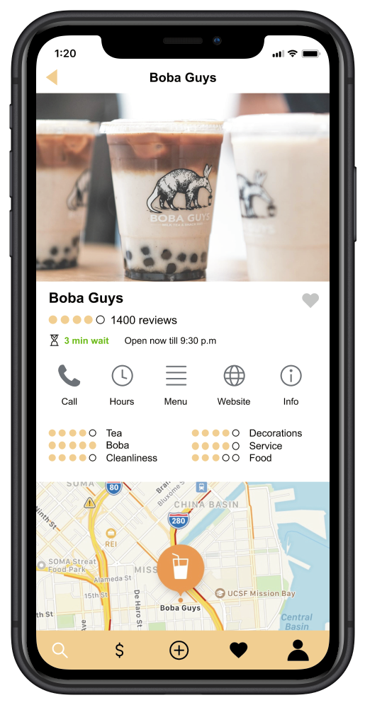
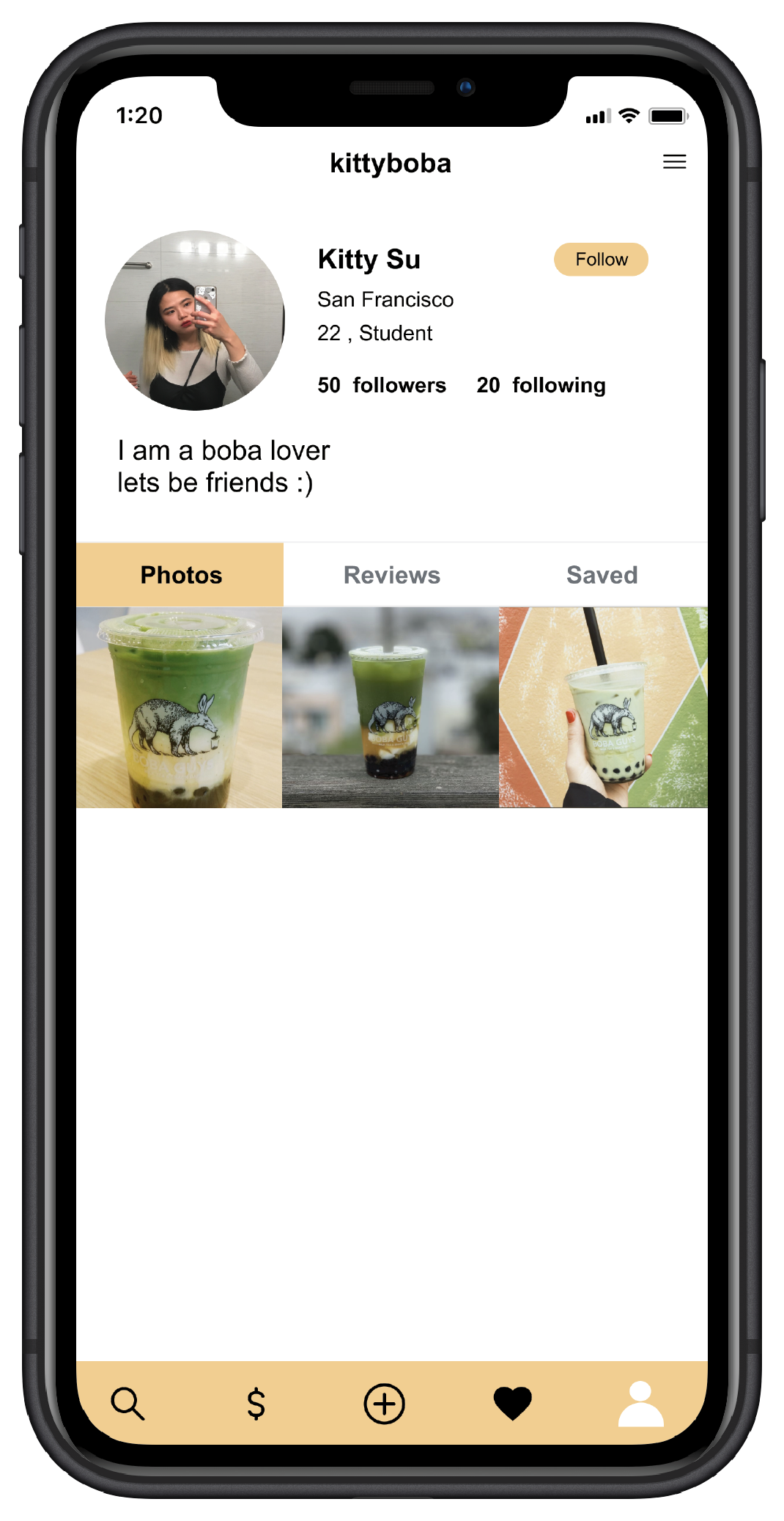
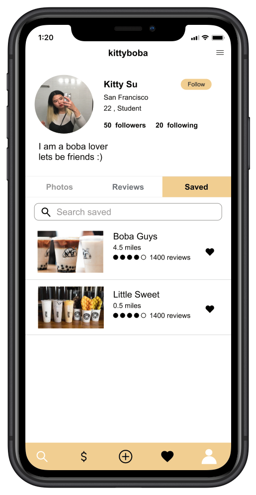
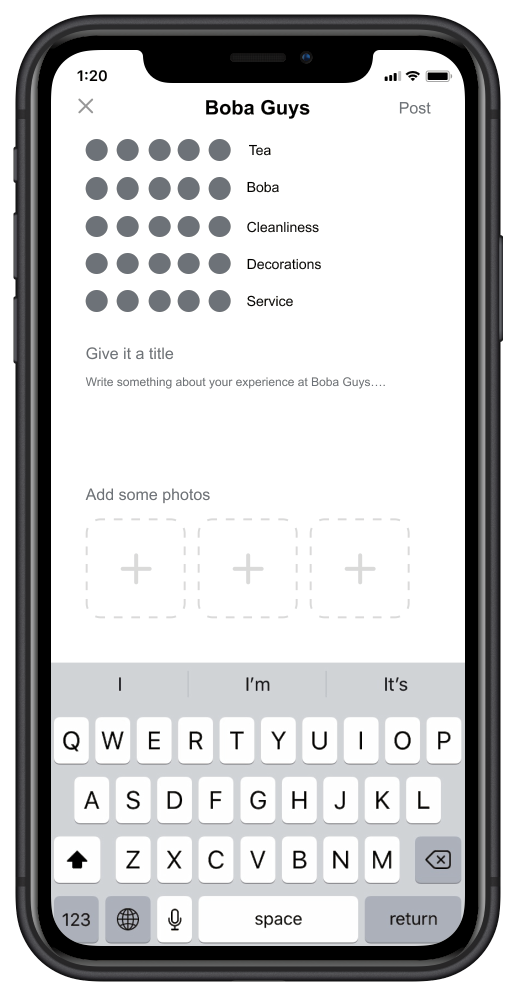
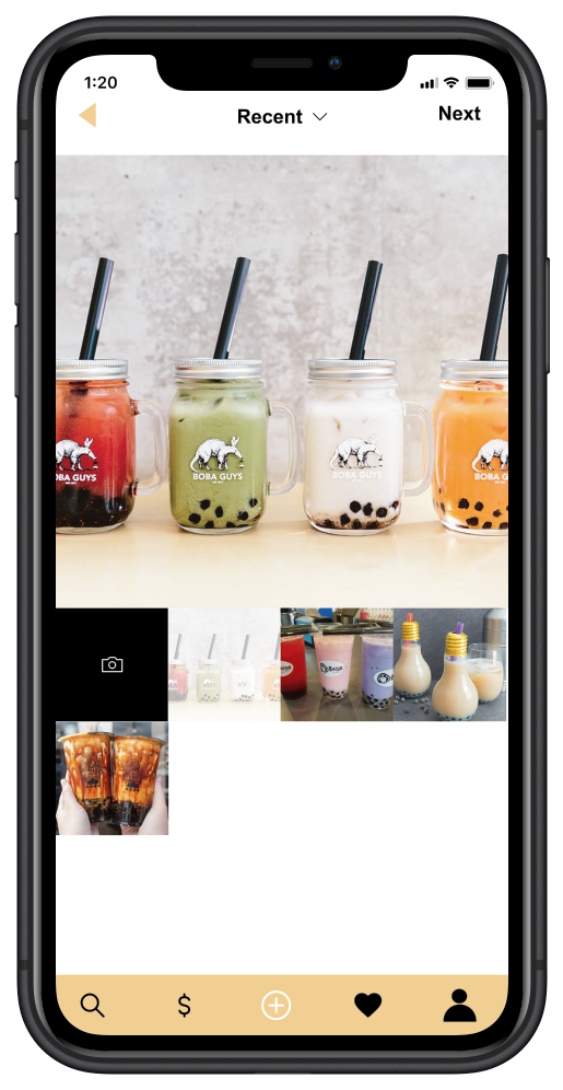
BOBA - a review app only focusing on boba. it provides a detailed rating for each boba store such as the rating on tea, pearls, services, food, decoration, etc. Displays the waiting time for the stores. A reward system that lets the customers collect their points on their phones.
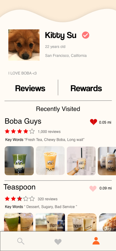
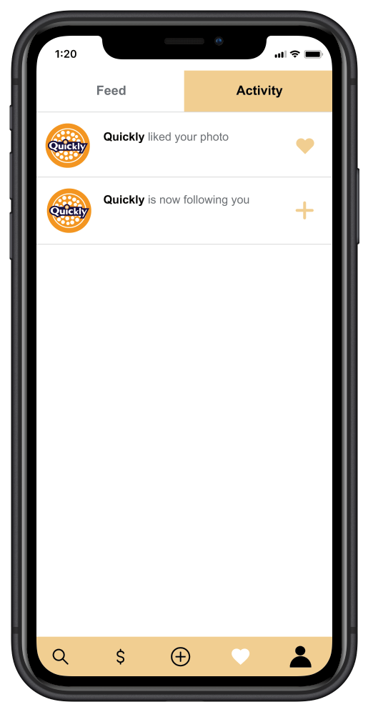
Boba is not just a review app but also a community for all the boba lovers. You can follow your friends and the boba stores. Also you can post and tag the stores you’ve visited while you enjoy your delicious boba.
1.3 Design Goals
2.1 Who will be the target audience?
Primary Target
People who get boba 1-3+ times every week.
People who get boba 1-3+ times every week.
Secondary Target
People who get boba at least 2-3+ times every month.
People who get boba at least 2-3+ times every month.
Tertiary Target
People who get boba less than 5-10 times in a year
People who get boba less than 5-10 times in a year
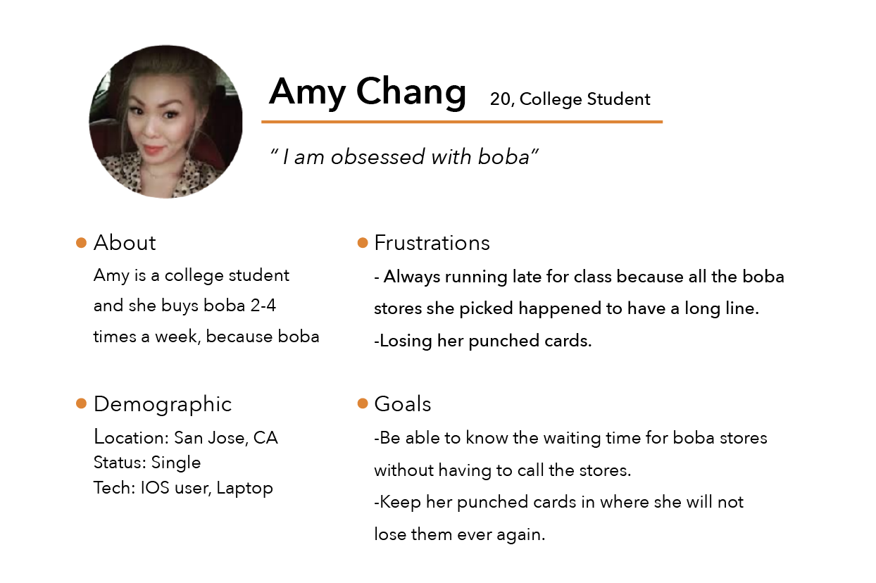
2.2 Persona
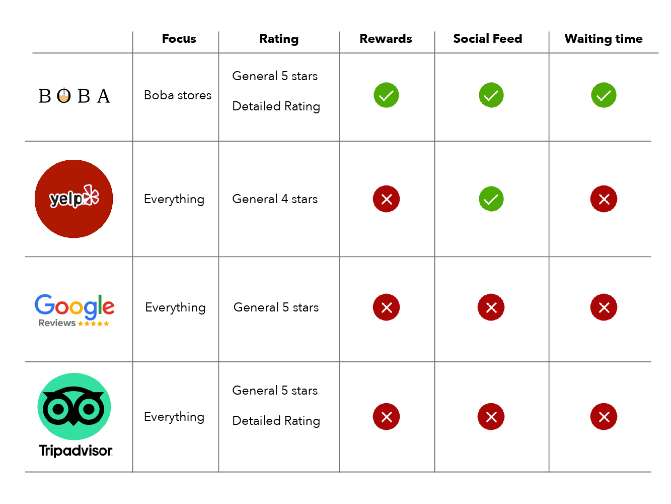
2.3 Competitors Feature Analysis
In the past, I have mostly used Yelp and Google to find boba places and I used TripAdvisor mostly for sightseeing.
Most of the time I find Yelp useful but just NOT for the boba stores.
03
Design Process
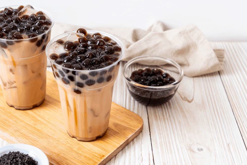
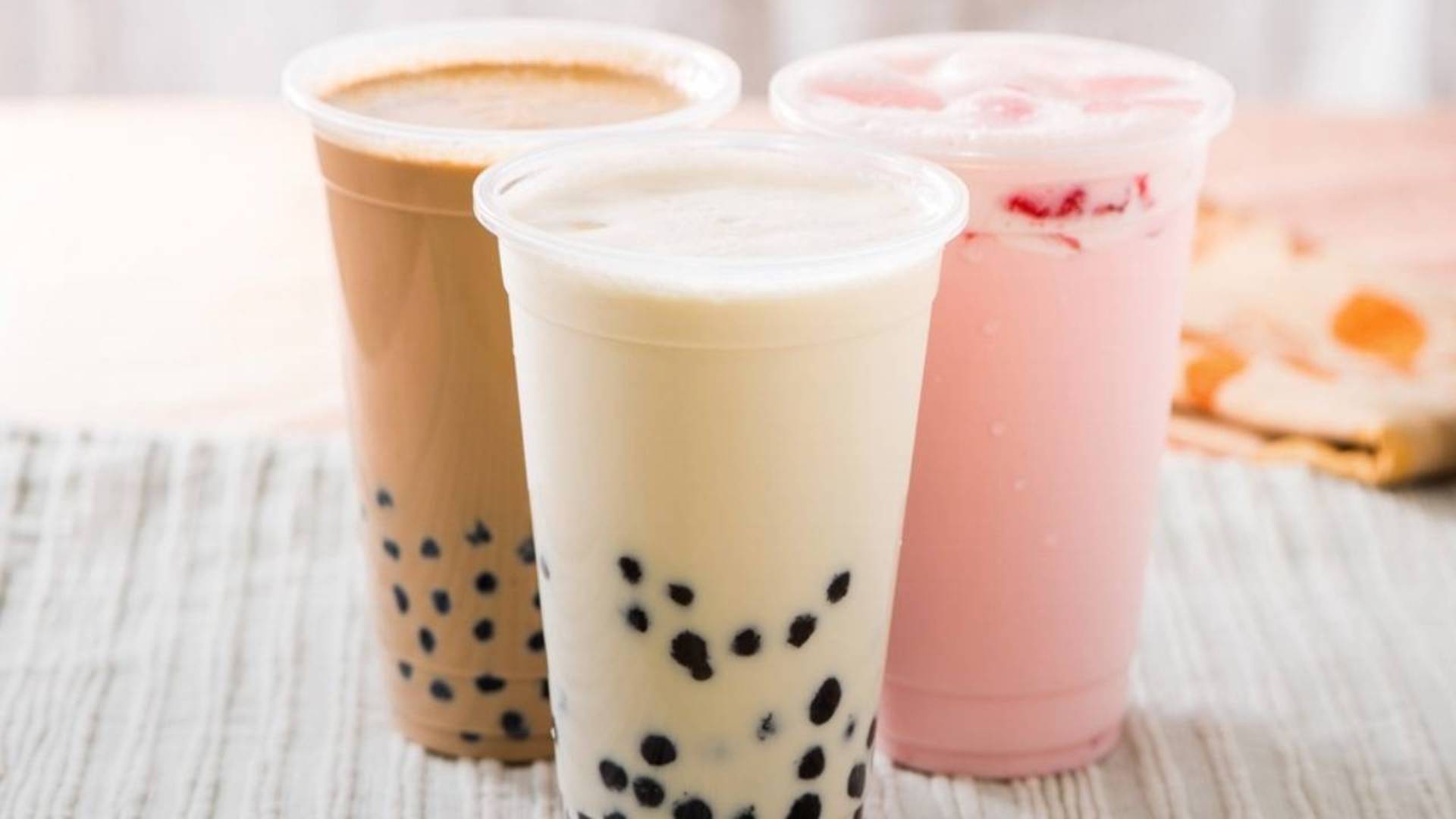
3.1 Inspirations
I found some pics of the boba drinks and use them as the inspiration for the design.
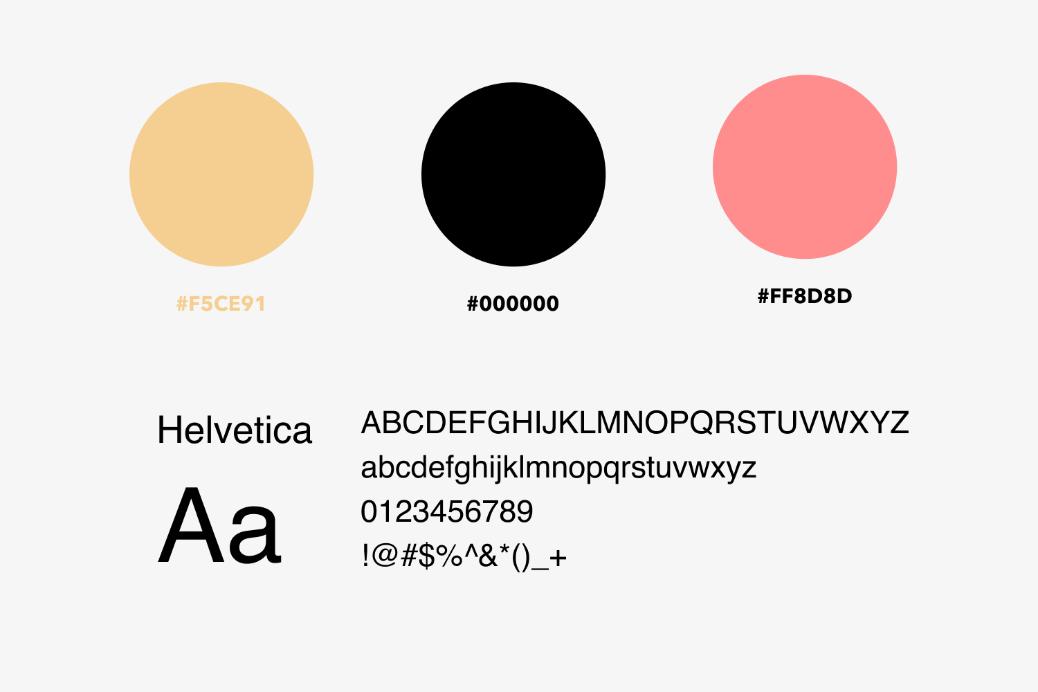
3.2 Branding
The branding is focused on the boba elements. I use Helvetica because it is simple and easy to read.
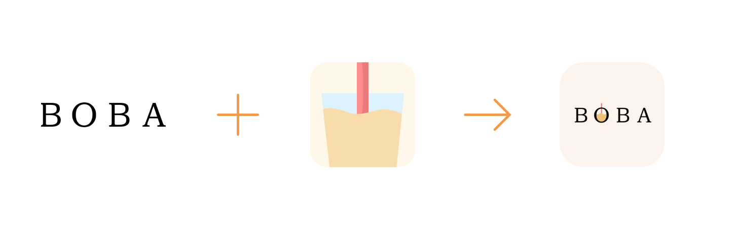
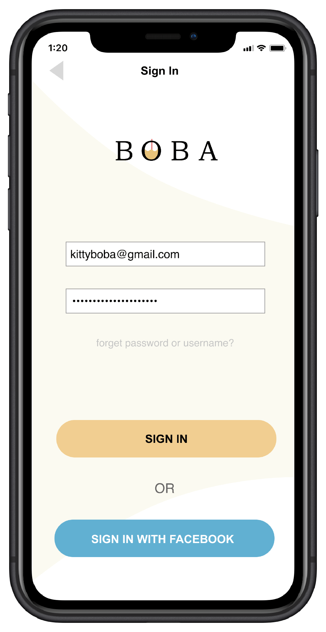
3.4 Logo
I have decided “boba“ will be the name for this app. It is obvious and catchy! I came up with the boba cup first, and I thought it just looks too boring and it blands into those free illustration vectors that you can find on the internet.
So I combined the boba cup witht BOBA. I love how it looks. There is a good contrast between the milk tea and the name of the app.
3.3 First Initial Design
The first concept of the design was for a school project in 2018 when I was new to UX/UI.
I decided to make a whole new design after learning more about UX/UI design skills. My first design lack of visual hierarchy and useful functions. The showcasing of the information was not effective, especially the font choices.
I believe I can do better now.
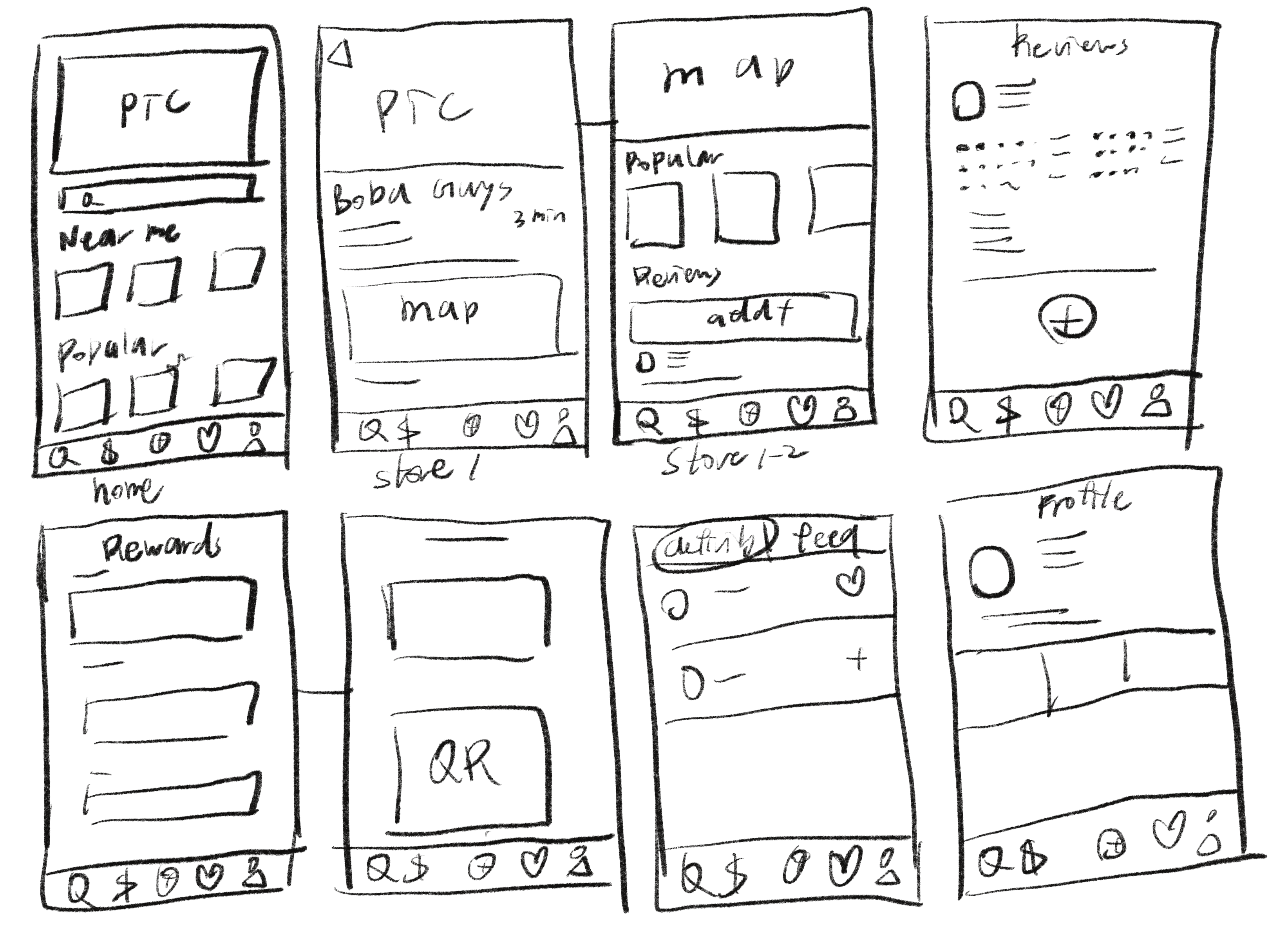
3.6 Sketches
I started sketching possible layouts for the new ideas I have.
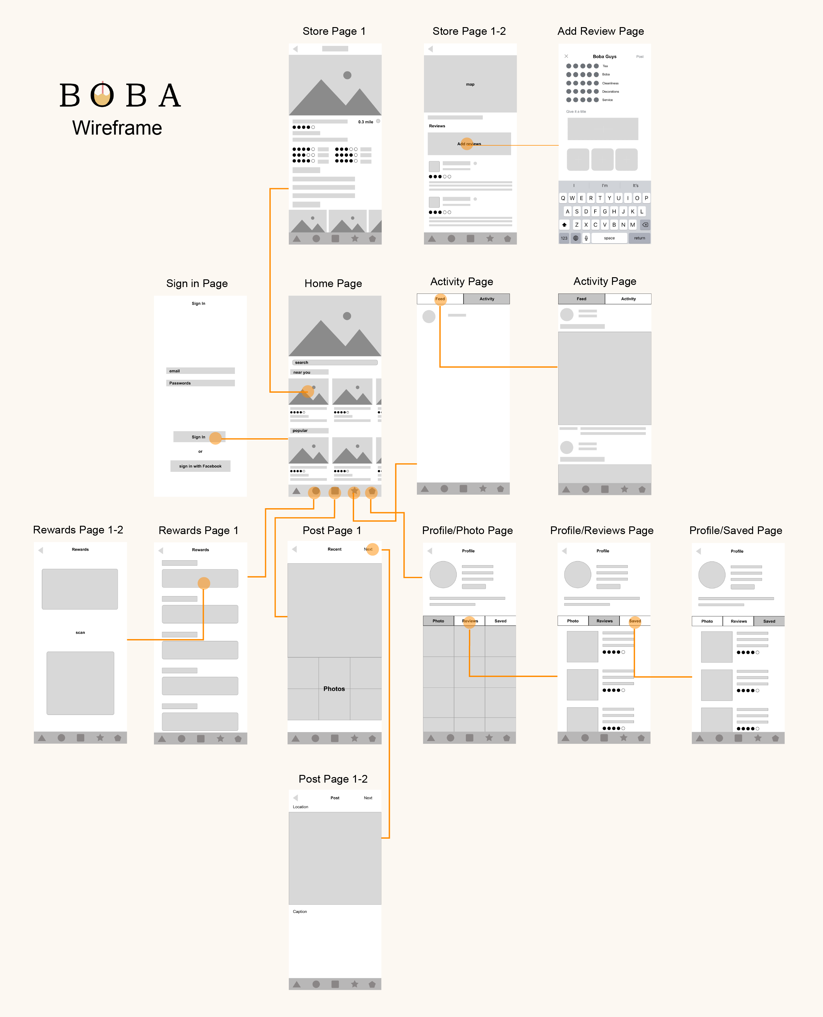
3.7 Wireframe
Here is the wireframe with main user flows.
04
Final Outcome
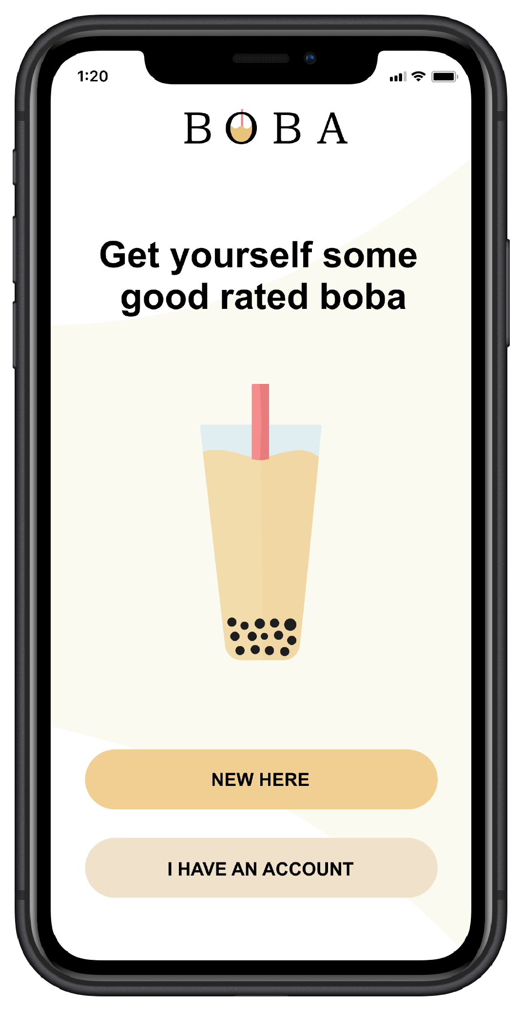
4.1 UI Design
4.2 Live Prototype
Yung Chuan Su 2024