
Mapping the invisible: Heartbreak
“Heartbreak Effects” maps my painful breakup process into a bittersweet journey.
Project Overview
Observe the non-visible. To collect and categorize data on the invisible and then make it visible
Role:
Visual Designer, Reseacher
Observe the non-visible. To collect and categorize data on the invisible and then make it visible
Role:
Visual Designer, Reseacher
Tool:
Illustrator
Timeline:
A month
Illustrator
Timeline:
A month
01
Research
1.1 What is invisible that can be mapped?
I started this assignment with brainstorming. This is how I usually get a lot of new ideas.

1.2 What is the scale of the data?
I first wrote out the scale options into two sections, Macro weekly and Micro daily. It would be easier for me to see how much data I want to include in this project.

1.3 What data am I using?
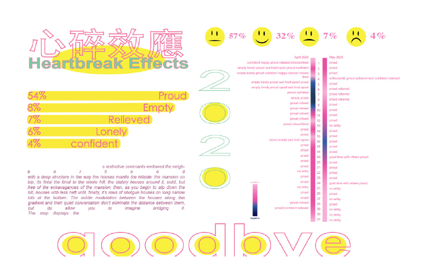
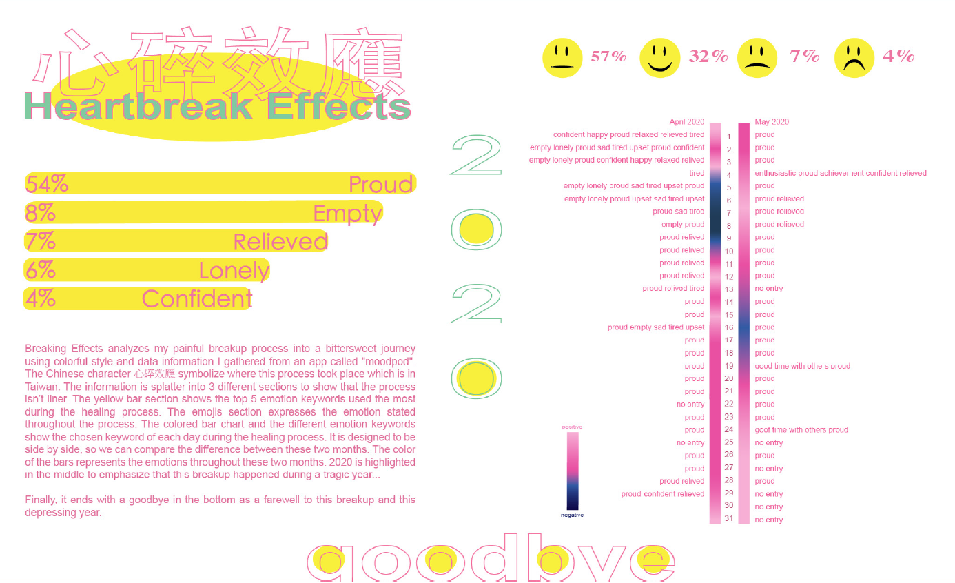
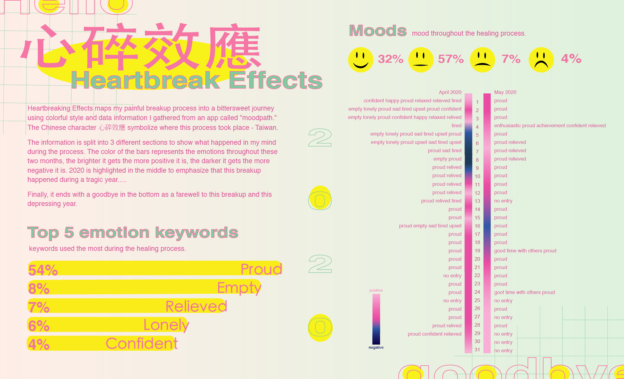
The data I am using is collected on this app called “Moodpath”. I entered my mood, my thoughts, and chose certain keywords and behaviors they provided in the app each day during April and May 2020.
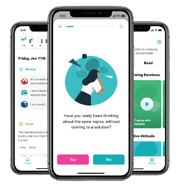
Moodpath

Data in Moodpath
1.4 Collecting Data
I collected all the information that I need from the app to a spreadsheet and calculated the numbers.
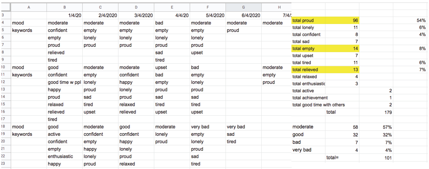
The data categories were as follows: 1- date 2- mood 3- keyword
02
Design Process
2.1 Inspiration
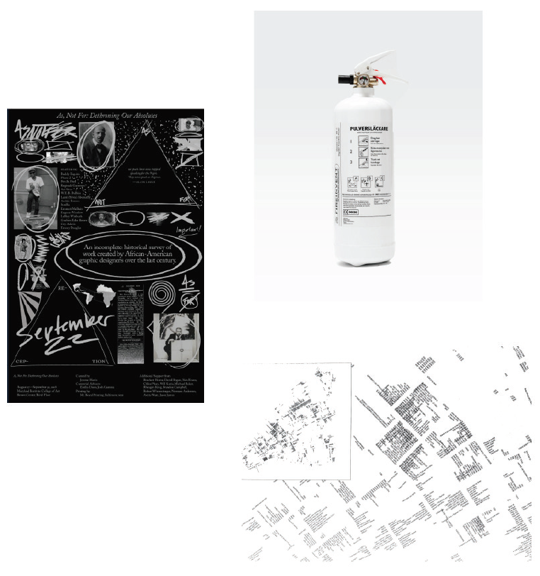
I found some inspirations that help me figure out how I might want the design to be like. I really like the simplicity, shapes, and colors in these designs I found.
2.2 Sketches
After knowing what data I am going to use, I quickly sketched out some possible layout for it. Out of all of the sketches I have, I really like the vertical one, I think it might work better with all the data I have.


03
Design iterations
3.1 Process work: initial layouts
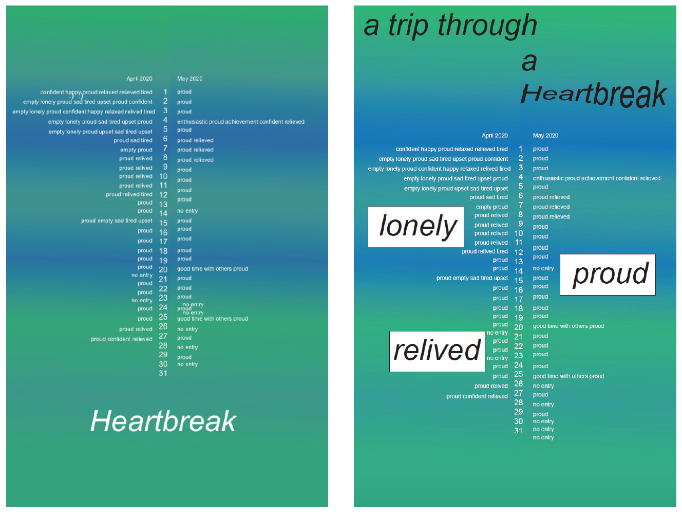
The colors that the app uses to indicated the mood is green to blue. Therefore, I used it as the background colors. The green means good and the darker it gets the worse it means.
3.2 First Version
That is why I switched the whole color palette to make it less messy and readable. I made the color of the mood into bars to showcase it in a clear way.
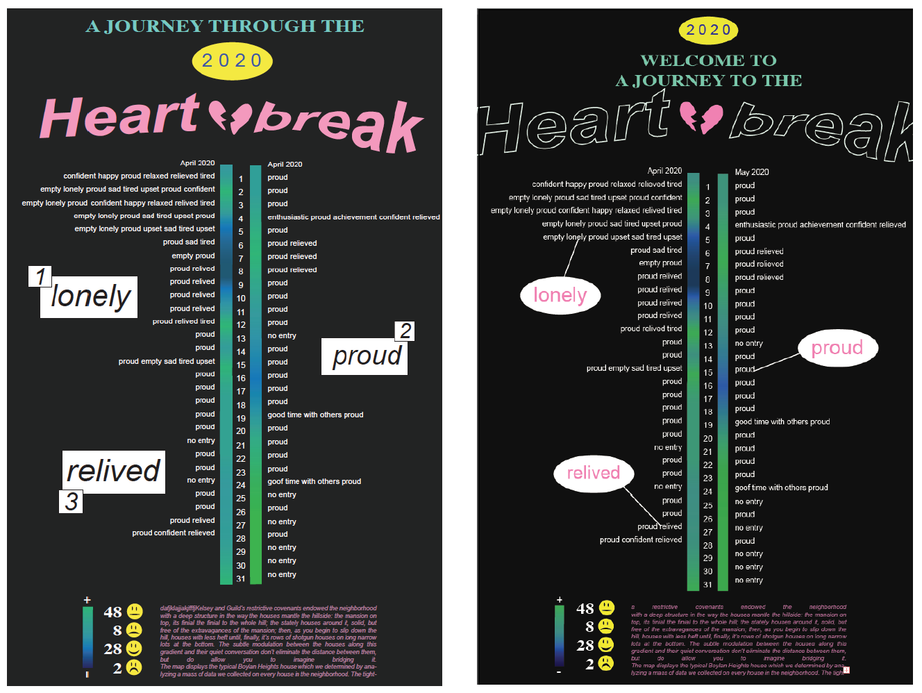
3.3 Second Version
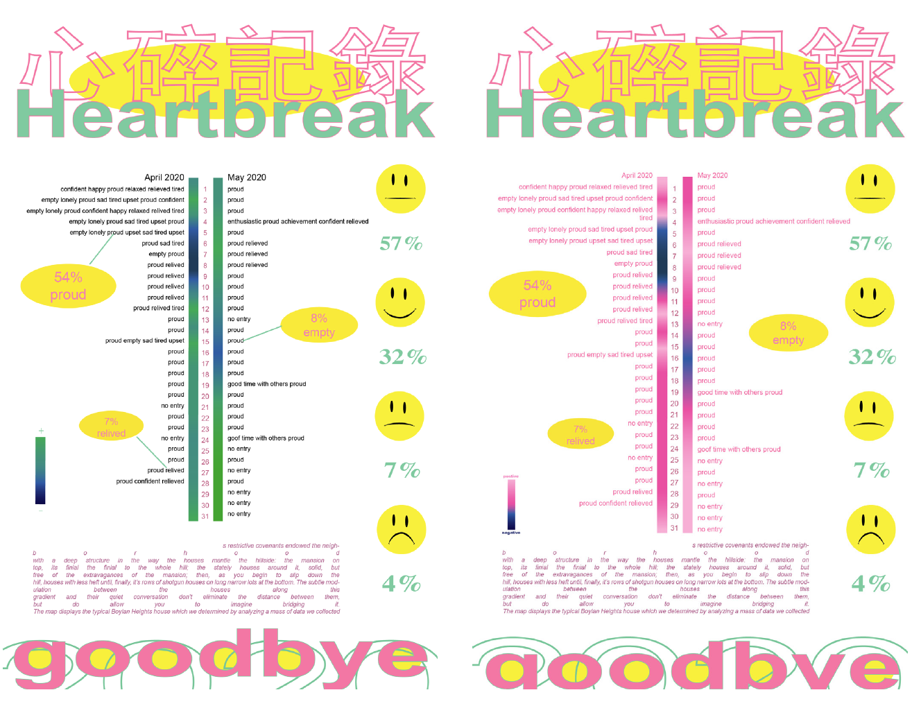
The other reason is that I’ve done most of my healing process in Taiwan and I thought I could include that identity in the poster as well. I changed the green colors of the emotions bars to pink to fit in the rest of the design better.
3.4 More Iterations
I thought I should try a different layout to see if it works better, and I am actually liking it…
I made the title different because I think it explained better than just “Heartbreak.” I also changed the top keywords to a bar format to display it clearly.
At this point, I decided to go with this layout.
04
Final Outcome
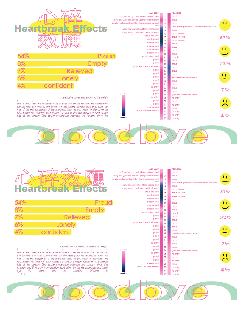
After receiving some comments from my classmates and professor, I changed little things like the alignment and I added more information to make it easier to understand the data. I also added a background color to make all the elements more cohesively. Overall, I really love how it came out.Final Outcome
My After Thoughts..
WOW! It was a very emotional and intimate project for me because I presented my own feelings and thoughts to everyone in the class and on the internet. I was not so sure if I should have done it, but making it the topic for this project really helped me understand how far I have come after this heartbreak. I now understand how powerful infographic is and what it can do with some invisible information.
I really enjoyed combining my personal feelings into my work. It is a way of me telling people a story of mine, to express myself. I hope you enjoy reading through this project, and if you were also experiencing any sort of heartbreak, just know that you should be proud of yourself because you have made it this far! Good luck🥂️
Yung Chuan Su 2024